
Imprint
AI startup developing new tokenizers for underrepresented languages
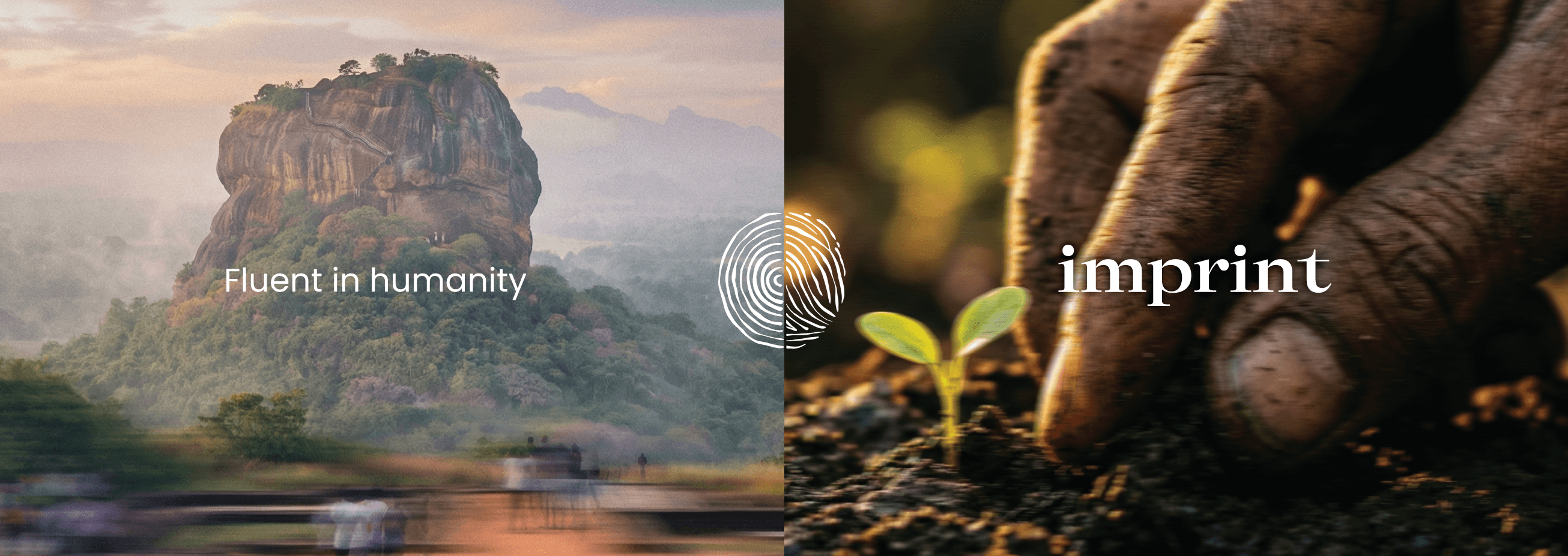
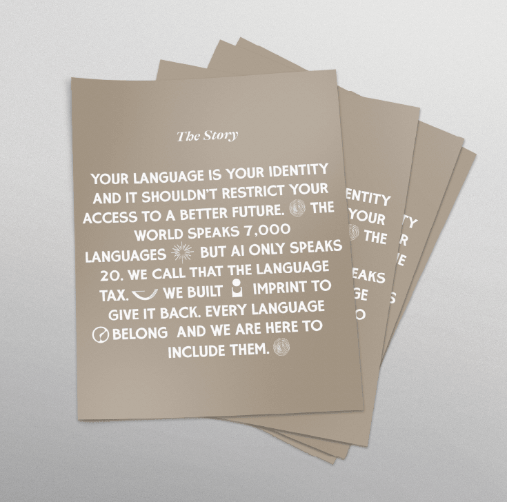
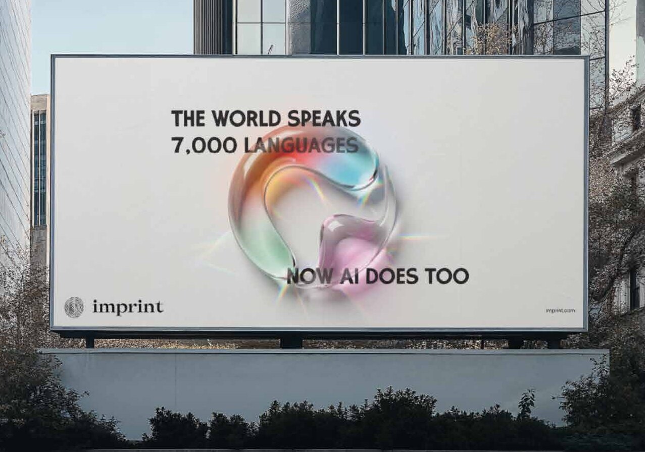
Imprint was created to bridge the global AI divide. While the world currently recognizes 7,000+ languages, AI is optimized for 20. The goal was to design a brand that feels warm, human, and culturally grounded on the front end, while masking a cutting-edge, highly complex infrastructure on the back end.
Imprint exists to ensure that local consumers and businesses in underrepresented regions can finally use AI as a powerful tailwind, rather than being blocked by the barriers of English-centric development and culturally void translations.
Services
- Logo design
- Brand identity
- Symbol design
- Brand graphics
- Pitch deck
- App icon
- Brand applications
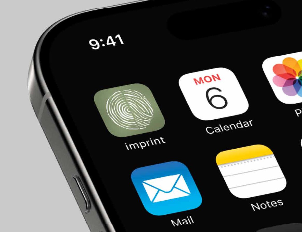
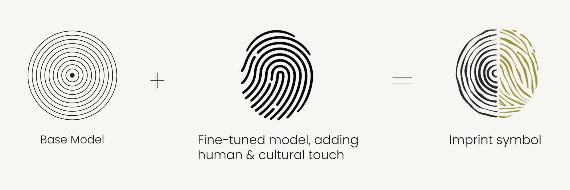
To visually translate the company’s core technology, I paired a concentric circle motif representing the AI “base model” with a hand-drawn thumbprint representing the human individuality and cultural context the technology aims to preserve. Together, these formed the Imprint symbol, illustrating how the company “imprints” cultural identity and under-resourced languages onto standard AI models.
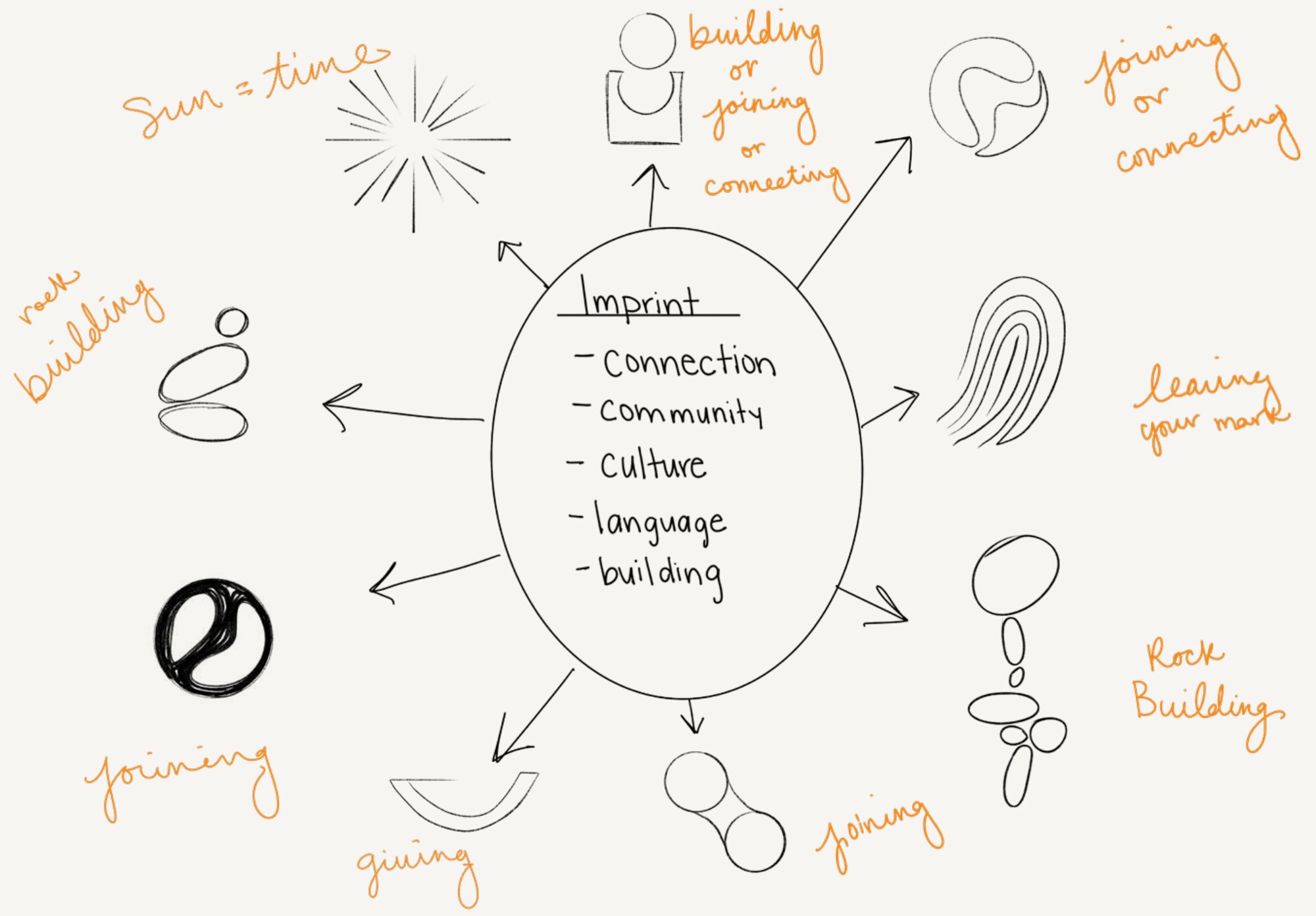
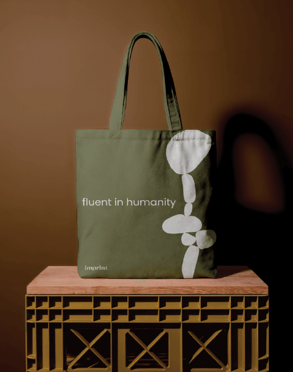
To expand the brand toolkit, I introduced fluid morphing shapes to convey language connectivity and a stacked rocks metaphor to reflect the delicate balance of adding cultural context to AI. Applied across the pitch deck and brand identity, these elements form a design system bridging technical innovation with a human focus.