

Isola
Reef-safe sunscreen brand built for beach life
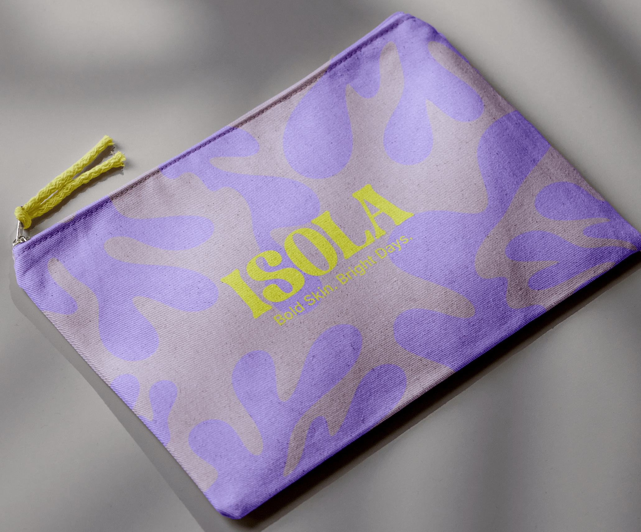
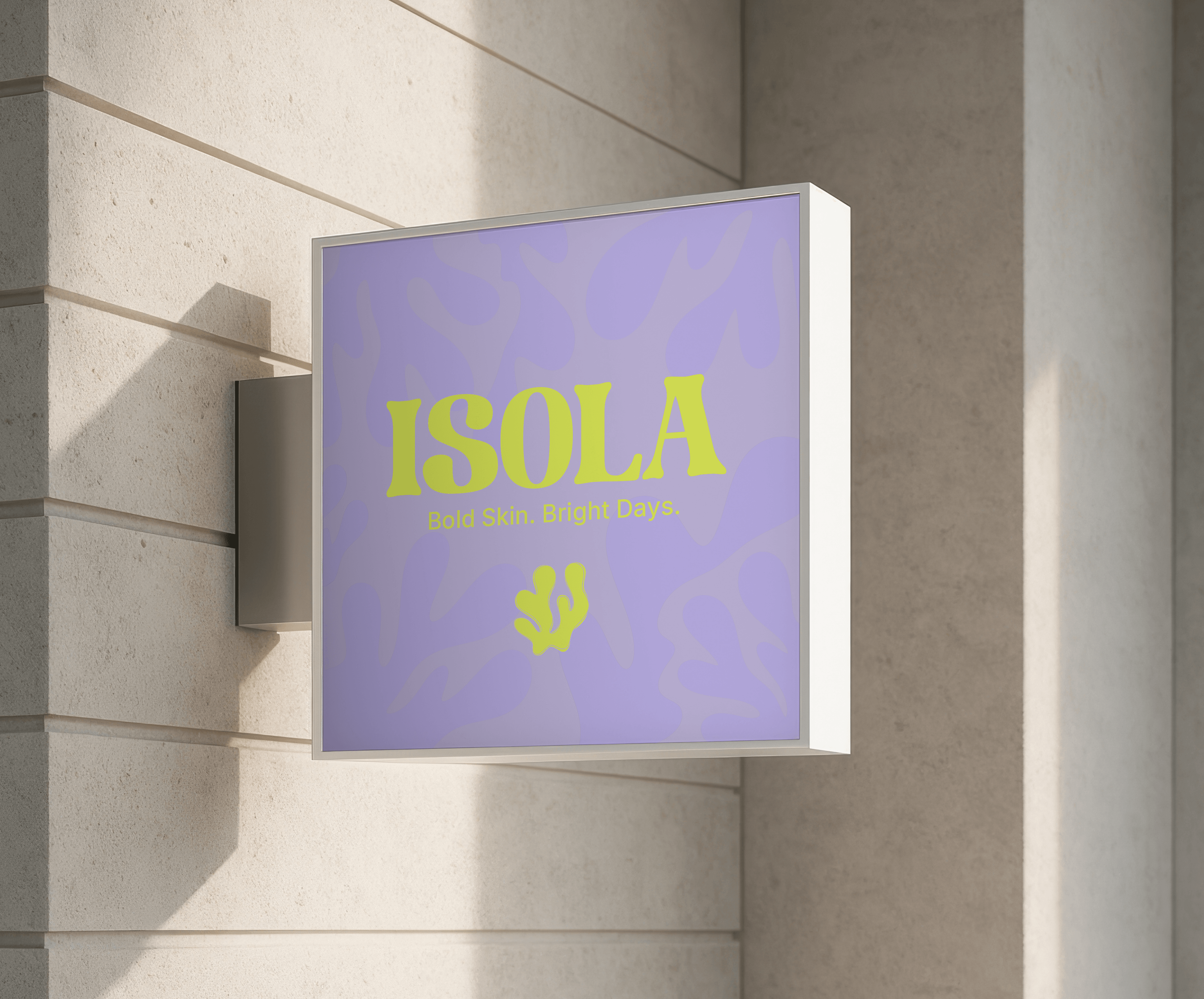
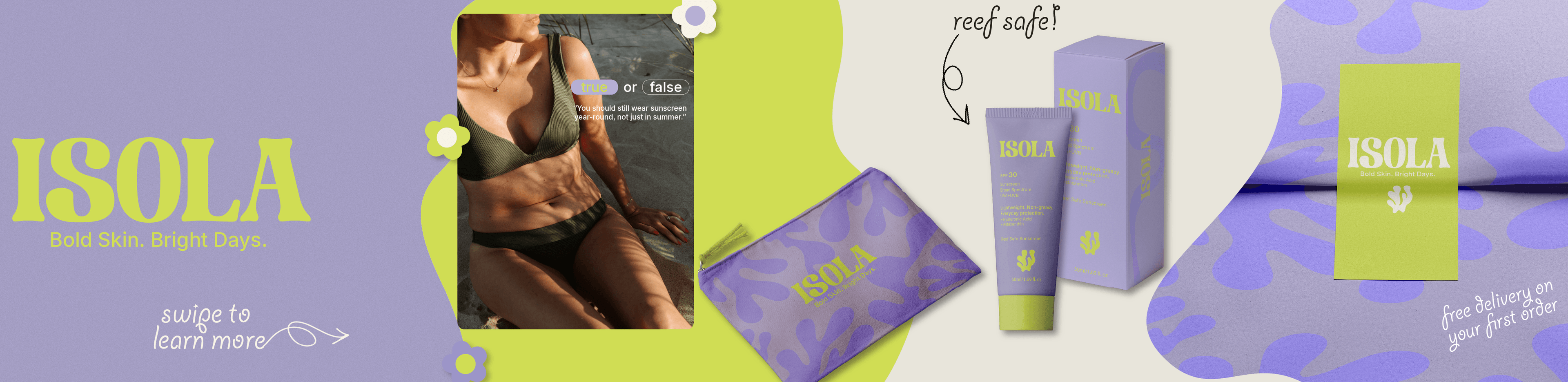
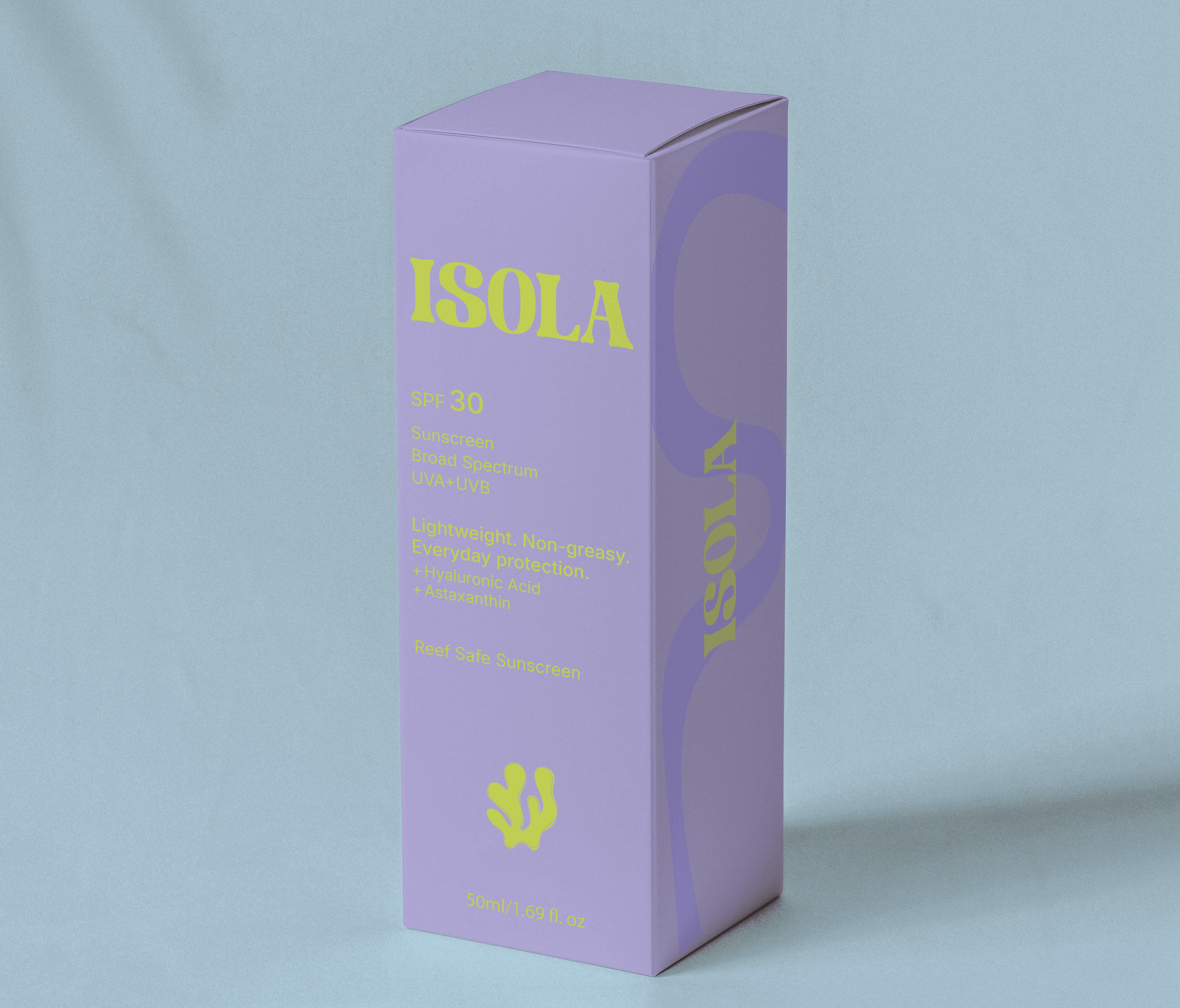
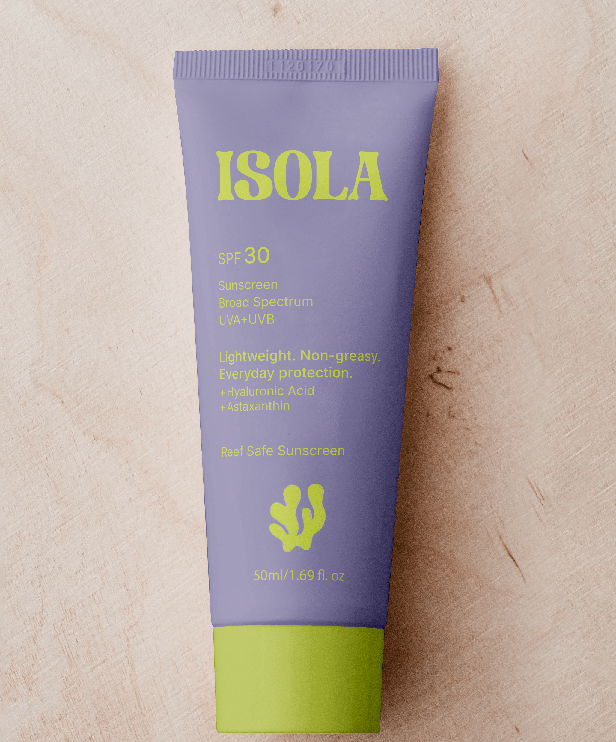
Isola is a reef-safe sunscreen built specifically for beach life. The goal was to design a bold, high-impact brand that protects skin without harming coral reefs while challenging the muted aesthetic often associated with sustainable products.
Isola embraces bright colors, confident typography, and sun-forward energy to make reef safe protection feel powerful, visible, and shelf-dominant.
Services
- Logo design
- Brand identity
- Character design
- Coral pattern system
- Color palette
- Typography
- Packaging design
- Social media
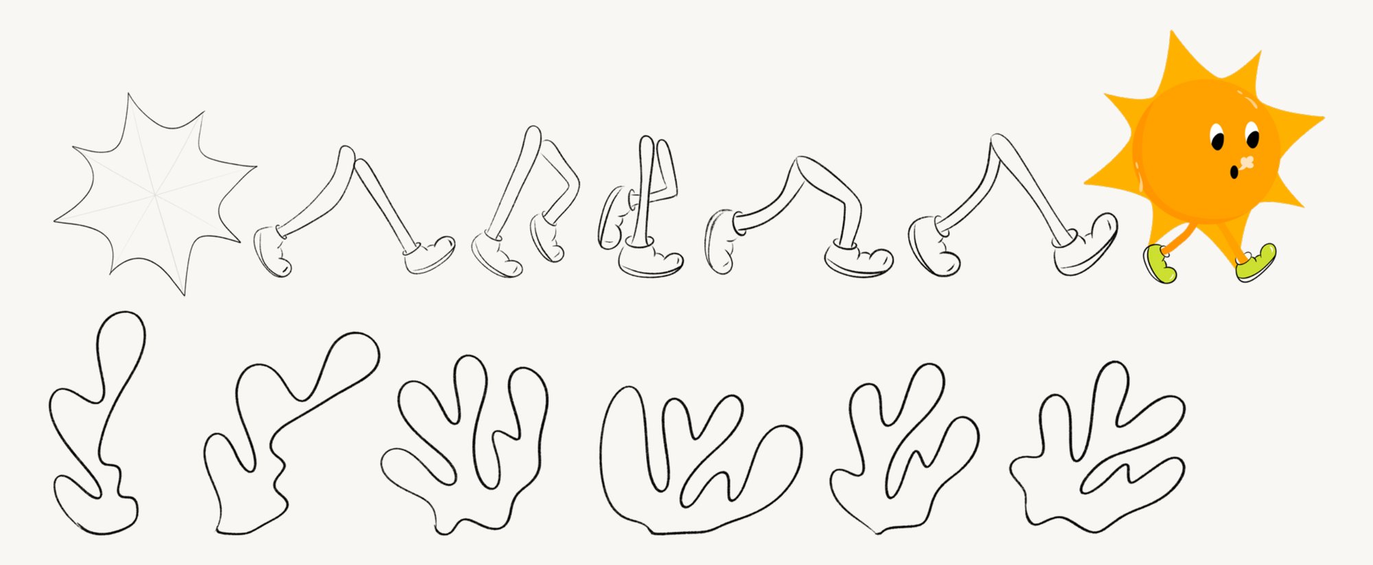
I began by sketching simplified sun forms and coral-inspired silhouettes to explore how reef safety and beach energy could translate visually. The top row focuses on motion development, experimenting with an animated sun character to introduce personality and warmth into the brand’s digital presence.
The bottom row explores abstract coral shapes, refining organic forms into scalable graphic elements that could function across packaging, pattern systems, and motion. These sketches helped define a visual language rooted in heat, movement, and marine protection.